Design guide
How to match cabinets, countertops and flooring
Pick one star (usually the countertop or the cabinet color), match undertones (warm with warm, cool with cool), and make sure there's contrast between the cabinets and the floor. Then check the combination together, in daylight, before you order.
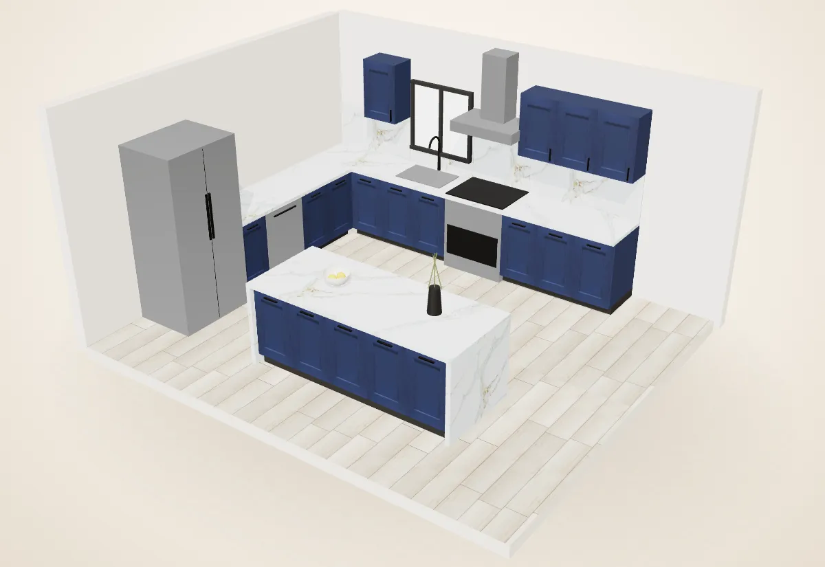
Most kitchens that feel "off" have a matching problem, not a quality problem: a cool grey cabinet next to a yellowish floor, or a busy slab fighting a busy floor. These four rules fix most of it.
Four rules that work
- One star. Let one thing be bold: a strongly veined countertop, a navy cabinet, or a wood-grain island. Keep the others calmer.
- Match undertones. Warm (yellow, gold, red, caramel, oak) goes with warm. Cool (blue, grey, crisp white, black) goes with cool. A gold-veined slab against cool grey cabinets can work, but only on purpose.
- Contrast the floor and the lower cabinets. If the base cabinets and the floor are the same value (same lightness), the room looks flat. Go lighter or darker by a clear step.
- Repeat colors. Echo the countertop's veining in the hardware, the pendant lights or the island color, so the room looks planned.
Five combinations that work
Classic bright: White Shaker + Calacatta-look quartz + light oak floor


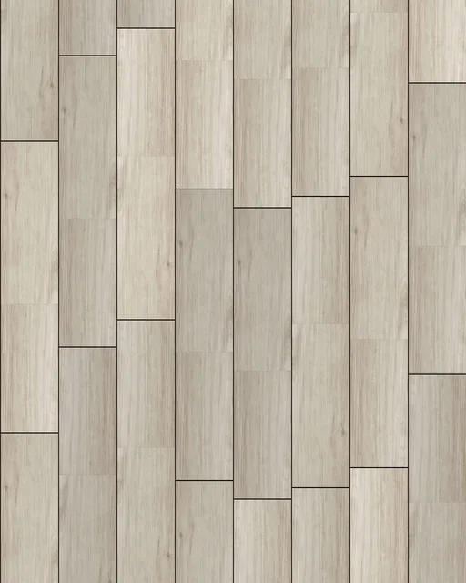
Timeless and bright; makes small kitchens feel bigger. Add warmth with brass or black hardware.
Navy and gold: Blue Shaker + Fantasy Gold + warm oak floor


The combination in our 3D kitchen. Navy is the star; the gold veining warms it up. Brass hardware ties it together.
Warm modern: Artisan White Oak + Carrara-look quartz + soft grey floor


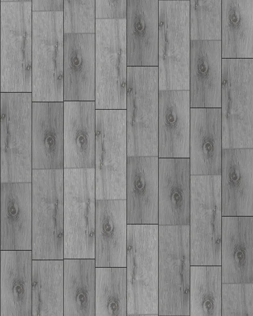
Wood grain is the star; a quiet slab keeps it calm. Great in open-plan rooms where the kitchen faces the living room.
Moody contrast: Mocha Shaker + bright white quartz + light floor

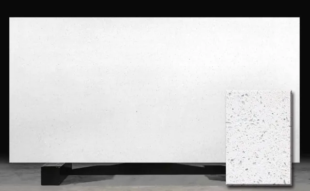
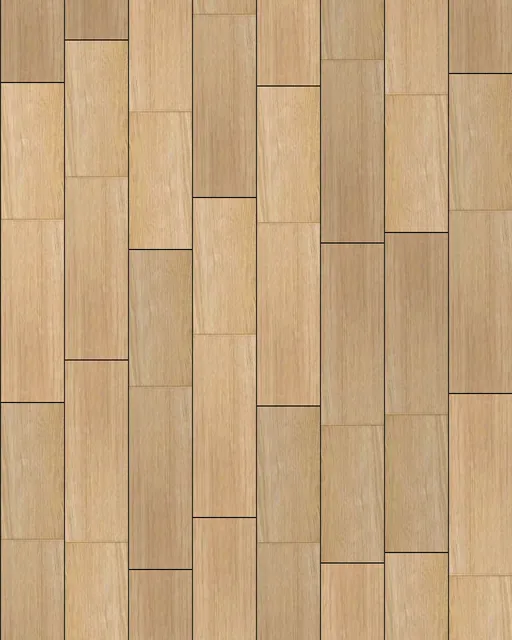
Dark cabinets need light counters and a lighter floor so the room doesn't close in. Best with good daylight.
Soft greige: Grey Shaker + grey-veined quartz + greige oak floor
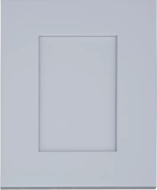

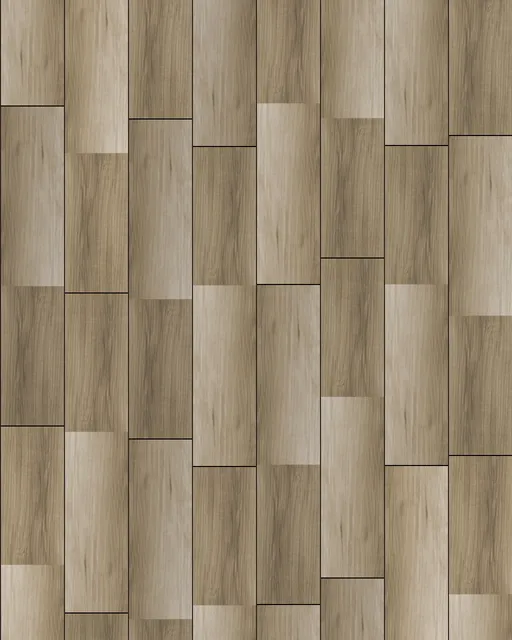
All cool and soft. Add a wood or black accent (open shelf, island, stools) so it doesn't feel cold.
Two-tone kitchens
A different color on the island (or on the lower cabinets) is the easiest way to add personality. Rules of thumb: dark below, light above; keep the uppers the lighter color; and repeat the island color once elsewhere, such as a pantry door or open shelves.
Check it before you order
- Look at samples together, side by side, not one at a time.
- See them in daylight and at night. Warm LEDs make whites look creamier; daylight shows undertones.
- Look at a big piece of the countertop. Veining that looks calm on a sample can be dramatic on a full slab.
- Use the 3D design. At the showroom we lay out your actual kitchen with your picks, so you can swap anything before ordering. You can try combinations right now in our mix-and-match 3D kitchen.
Questions
Should the floor be lighter or darker than the cabinets?
Either works as long as there's a clear difference. Light cabinets with a medium wood floor, or dark cabinets with a lighter floor, are the safest choices.
Should the countertop match the cabinets or the floor?
Neither needs to match exactly. The countertop usually ties the two together: pick one whose veining or background picks up a color from the cabinets or the floor.
What countertop goes with navy blue cabinets?
Bright white or Calacatta-look quartz for crisp contrast, or a gold-veined slab like Fantasy Gold for a warm, rich look.
What countertop goes with wood cabinets?
A quiet, light slab such as a Carrara look lets the wood grain stand out. Avoid busy veining with busy grain.